Why learn how to design a logo?
If you’re wondering how to design a logo, there’s a lot to think about. Logo design takes skill, experience and knowledge, and you’ll need practice working with a range of different brands aiming to communicate different messages. Underpinning all that is design theory, and the golden rules logo designers need to be familiar with.
First up, let’s just remind ourselves of why logo design is so important. A logo is usually the first piece of branding that a potential customer sees. It’s also usually the piece that makes the biggest impression on us and stays with us the longest (if it’s successful, that is). A logo can tell us a lot about a brand, including (sometimes) what a brand does and what it stands for. When consumers connect with a logo design, they’re often more inclined to invest their time or money in the company or product.
1. Personal touch
As a freelancer, you must distinguish your products or services from competitors in the market. To do that, you need to sprinkle some personality into your logo.
By adding a dash of your personal touch to the design, your logo will showcase your unique characteristics and create an instant connection with your target audience.
People automatically respond to authenticity, which in turn creates strong consumer loyalty and a community where you can promote your freelancing services.
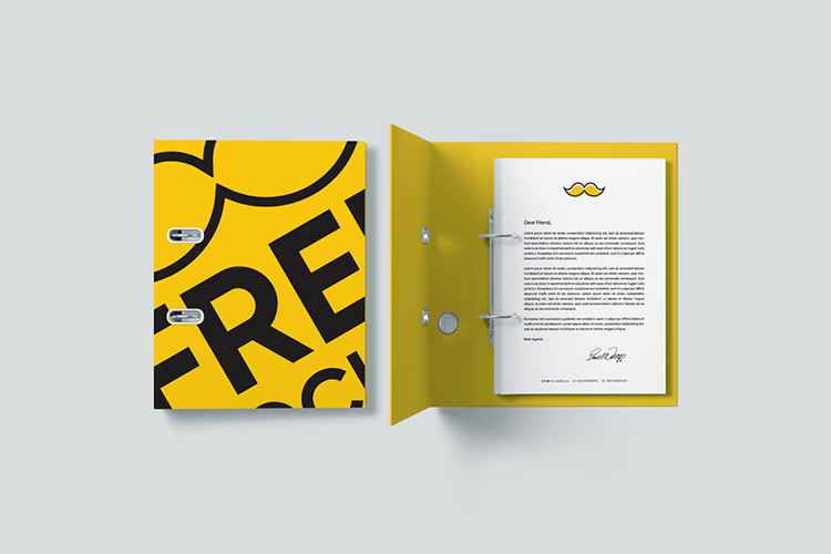
Incorporating your name in your logo is a great and simple way to add a personal touch. You can include your name with a signature-style logo (think Walt Disney), wordmark (FedEx), or initials (BMW).
You can also experiment with signature style fonts to take your logo design up a notch. You may want to consider hand-drawn lettering to be sure your logo looks different than anyone else’s.
2. Icon choice
An icon-based logo is a symbol that reflects your business uniquely and recognizably.
There are a few different types of icons, including abstract, geometric, pictorial, crests and emblems, interactive, and custom. Each type has its own meaning and purpose.
Try to find an icon that represents your freelance business, but be careful not to use overly-used symbols. For example, if you’re a writer, you might consider a writing instrument like a pencil. But that’s rather obvious and a bit generic, right? Instead, what do you offer that is unique? Maybe your specialty is editing, in which case you could choose an eraser or delete button icon.
The options are limitless! However, make sure your creativity didn’t take the icon in an unrecognizable direction.
Also, if you’re a skilled artist, you might consider creating a logo sketch yourself!
3. Color scheme
Colors influence our perception and evoke certain emotions, even if we don’t always realize it on a conscious level. Your logo’s color scheme depends on the message you want to convey to your target audience as well as industry best practices.
A doula, for example, would pick a color scheme like yellow (to convey happiness and positivity) and blue (to inspire a sense of calm and wisdom). Meanwhile, a financial advisor might go with a more conservation color scheme like black and white.
Again, always think about ways you can add your own personal touch.
4. Simplicity
Great logos should be seen from a distance and stand out from a crowd without being over-the-top extra.
Trust me when I say the best logos are simple. Clients want to work with an established professional who takes their work seriously.
As the face of your freelancing business, your logo design immediately tells prospective clients what kind of professional you are. If your logo is tacky, excessive, or just lacking, it will be a negative reflection and tarnish your reputation.
The key is to carefully design a freelance logo that matches your skills and profession in a simple, easily recognizable way.
In commodo luctus metus, vel auctor metus luctus in, class aptent taciti sociosqu ad litora torquent per conubia nostra, per inceptos himenaeos aliquam dapibus lobortis ligula.
Great info!